Michelle Irwin
Graphic Designer
Create. Excite. Repeat.
Selected Work
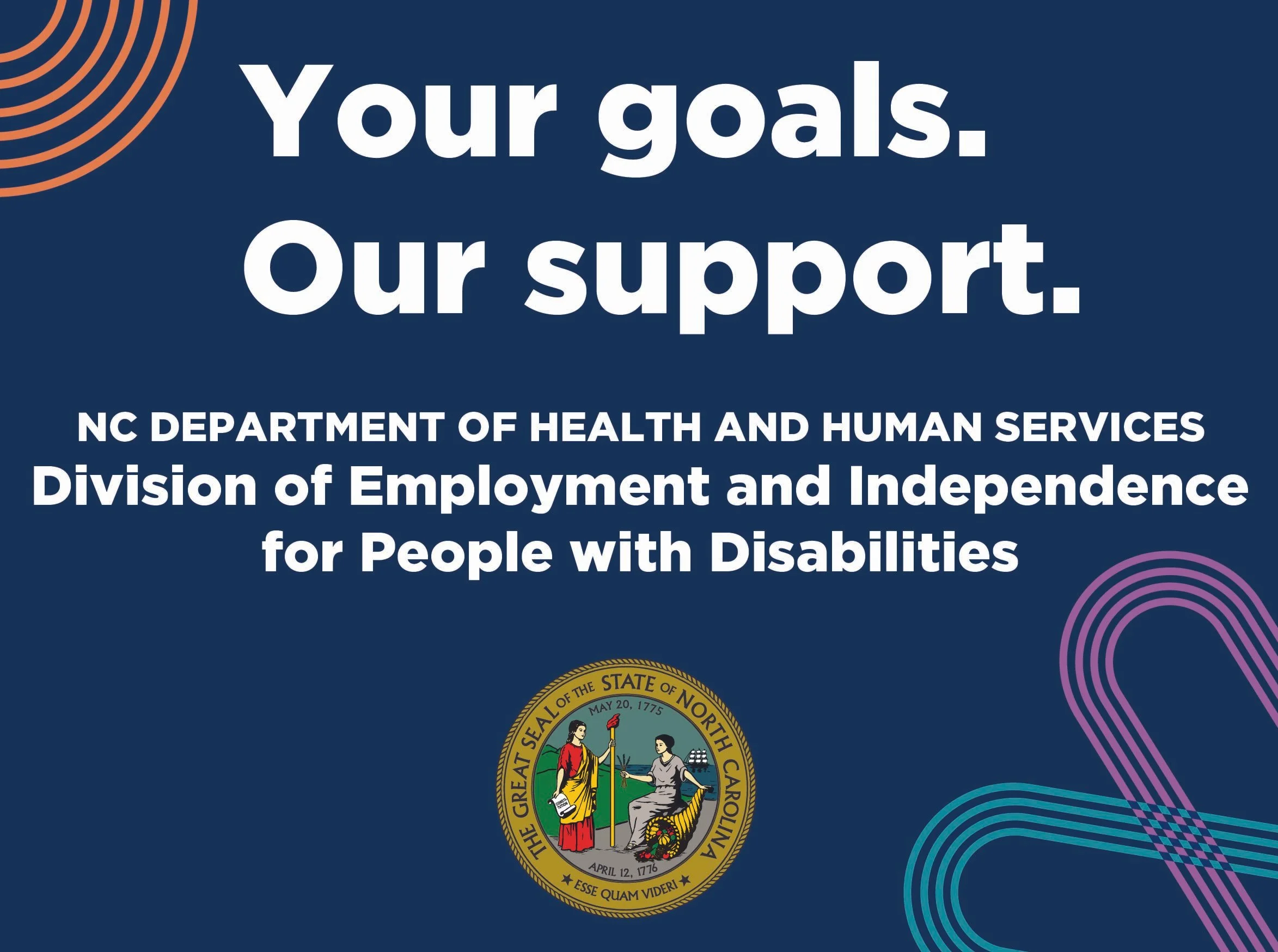
Problem
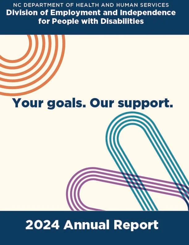
The department needed an annual report that presented a large amount of program information in a clear, organized, and accessible format. My supervisor also wanted the report to incorporate photographs and graphics to make the information more visually engaging.
Process
Created thumbnail sketches to explore and evaluate page layouts before developing the final publication. Built the layouts by organizing text, photographs, graphics, and data visualizations, creating graphs and applying typography, color, visual hierarchy, and structured layout to guide readers through the information.
Results
Produced a cohesive multi-page annual report that organized complex program information into an accessible visual format. The completed publication combined editorial layout, photography, graphics, and data visualizations to communicate information clearly while maintaining consistency with department branding and accessibility requirements.
Annual Report | Publication Design

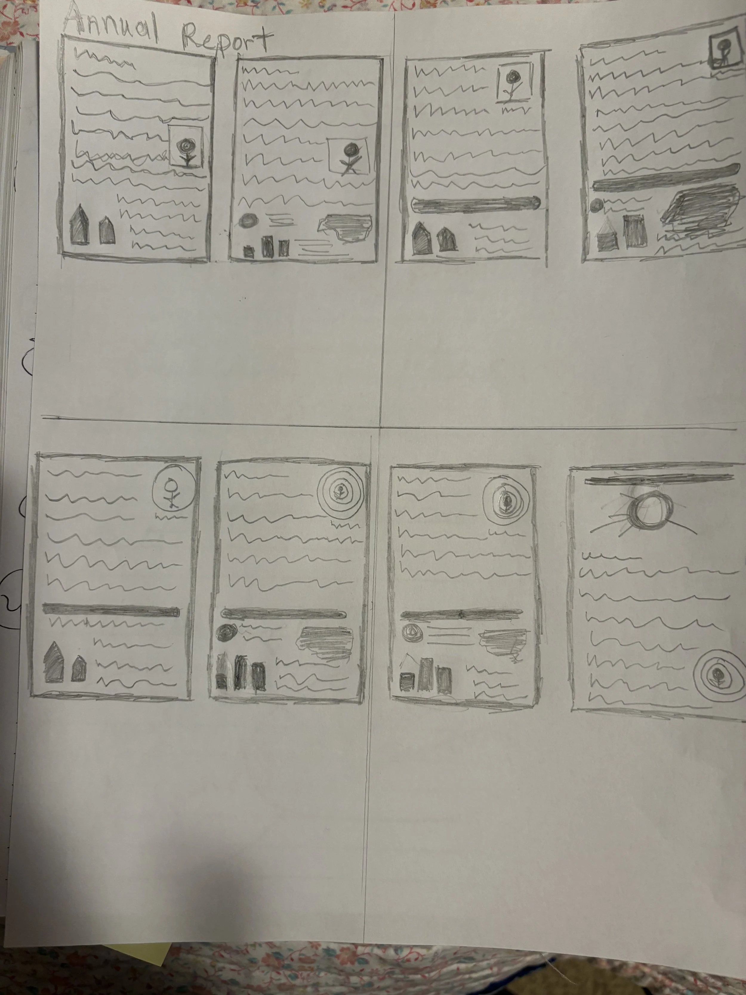
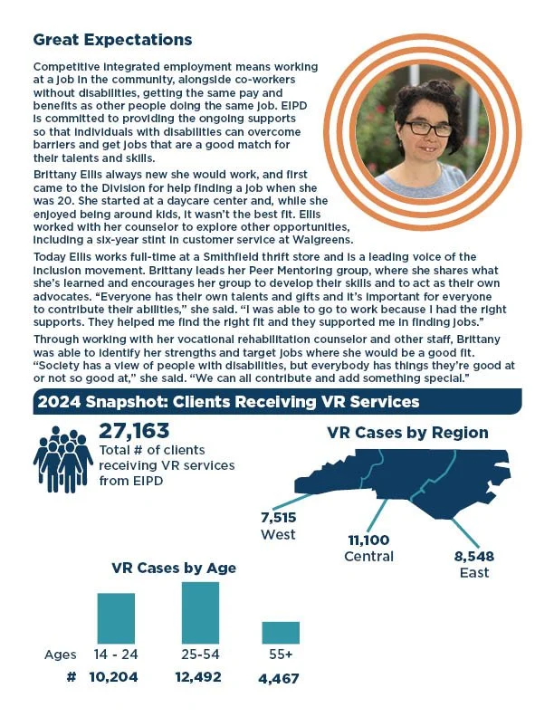
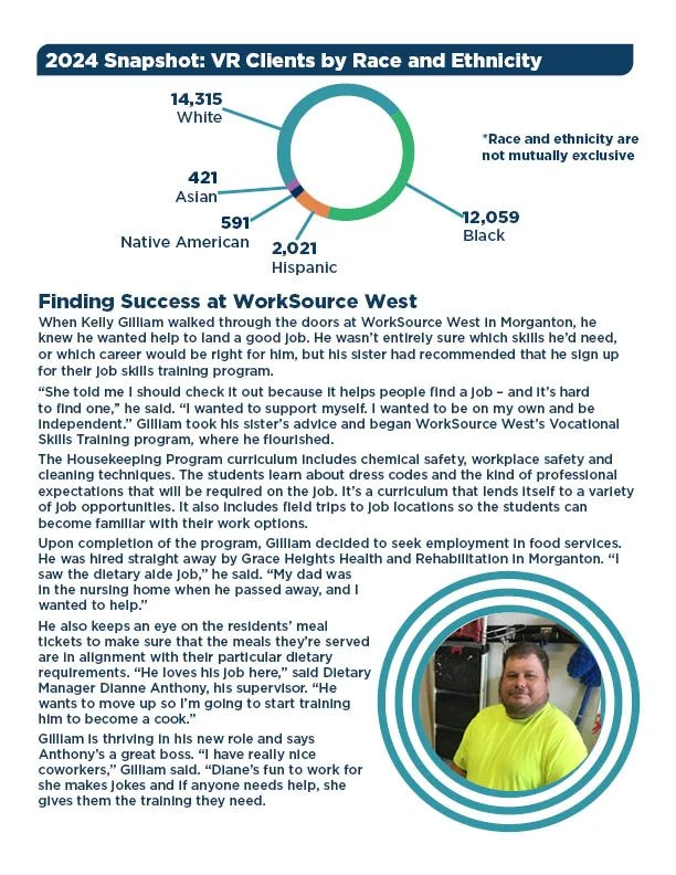
Flipbook, click the arrow: Entire annual report pages
Deaf Jobseeker Services Brochure | Print Design
Problem
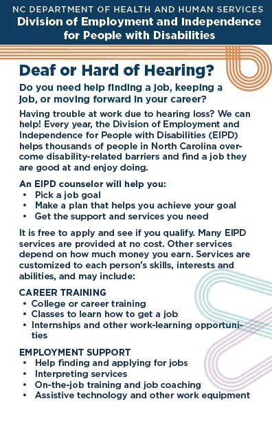
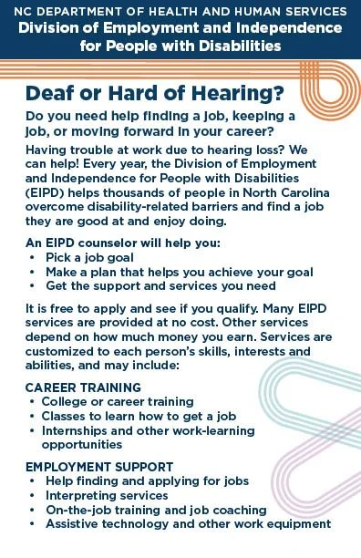
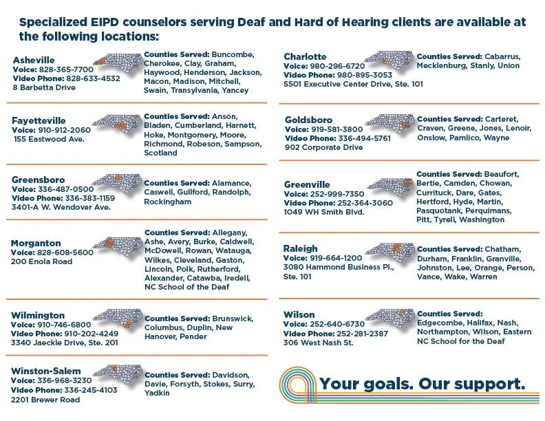
The department needed a brochure that provided jobseekers with information about office locations across North Carolina, including individual county maps, office addresses, and phone numbers. The challenge was fitting multiple maps and detailed location information into a clear, usable brochure format.
Process
Organized the office information and determined which counties corresponded to each office location. Reduced the maps to an appropriate size while maintaining readability, colored the relevant counties to make locations easy to identify, and arranged the maps, addresses, and phone numbers within the brochure to use the available space effectively.
Results
Created an organized print brochure that combined multiple maps with office contact information in a compact, accessible format. The finished design made geographic locations easier to identify while keeping addresses and phone numbers together with the corresponding office information.
.
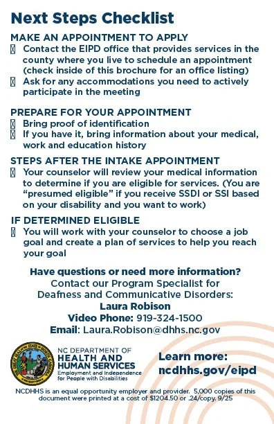
Bridge to Success | Brand Identity
Problem
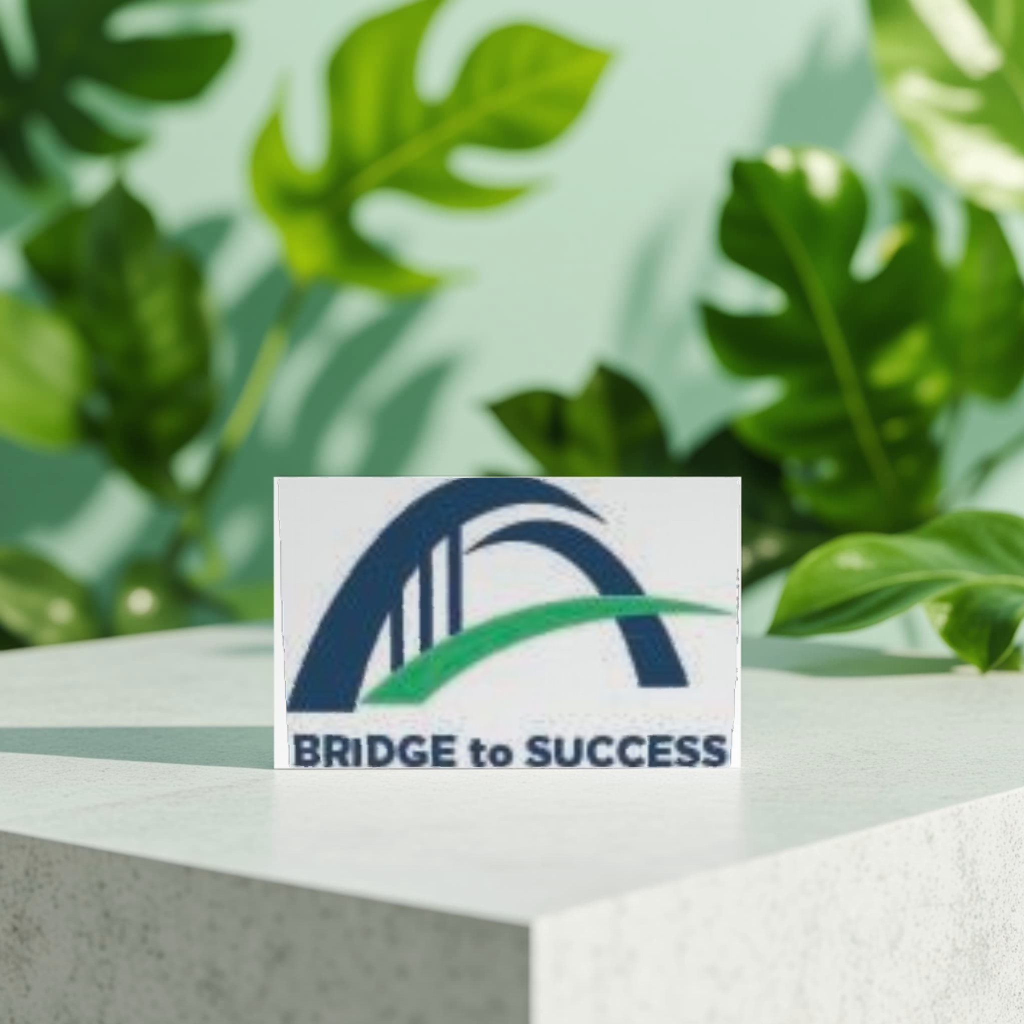
A new division needed a visual identity and logo that communicated the concept of a bridge while avoiding a literal representation. The challenge was to create a recognizable and meaningful concept that could establish a visual identity for the new division.
Process
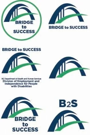
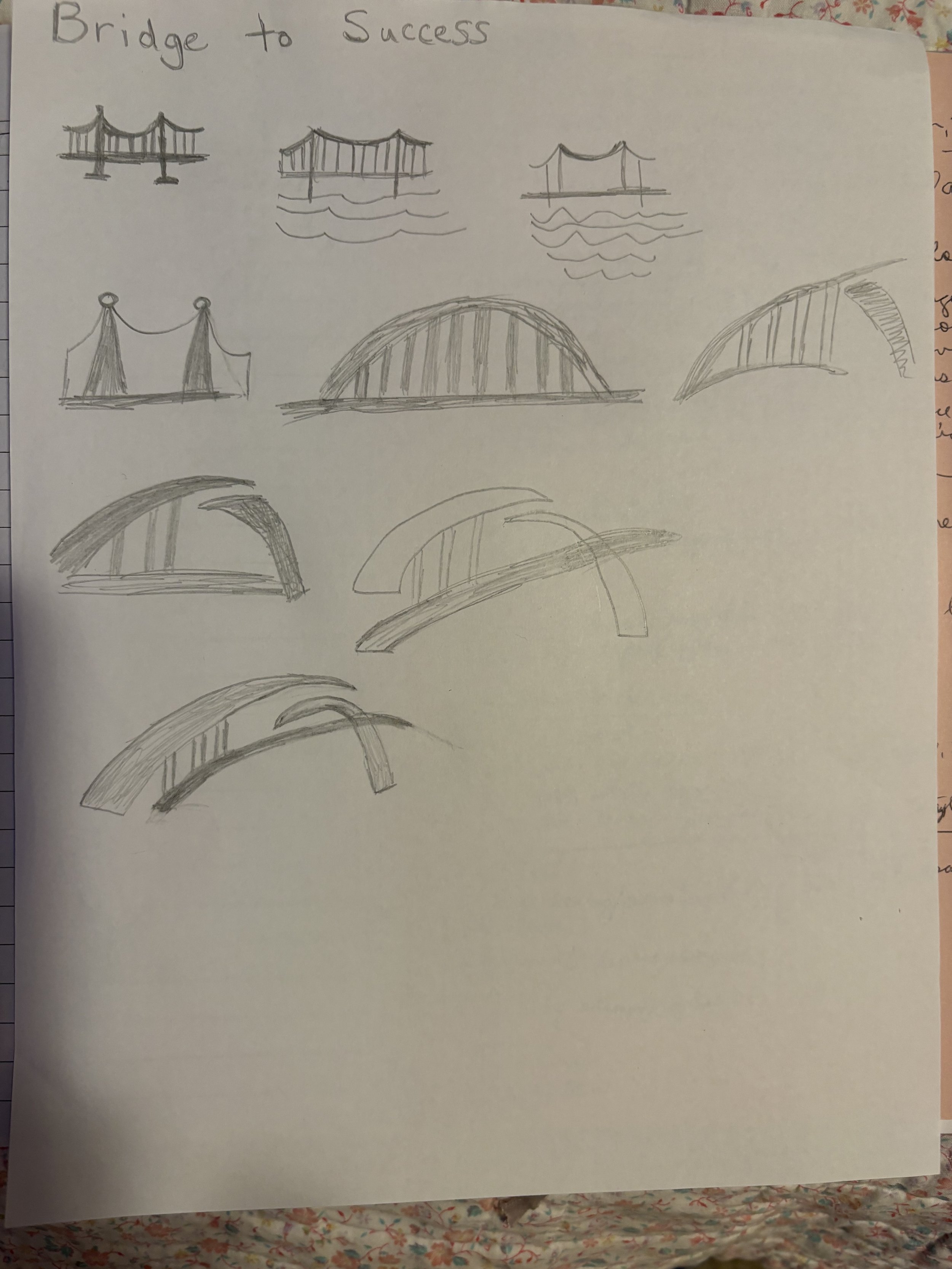
Researched visual concepts and references to explore creative ways to represent the idea of a bridge. Developed thumbnail sketches to explore different directions, then created multiple logo concepts for supervisor review. Preserved the unused concepts at my supervisor's request for potential future use and incorporated the selected logo into a promotional flyer for the new division.
Results
Created a distinctive logo that represented the bridge concept without depicting a literal bridge and established a visual foundation for the new division. Applied the selected identity to a promotional flyer, demonstrating how the logo could be incorporated into the division's communications.

Professional Testimonial
I am pleased to offer this testimonial in support of Michelle Irwin, an early career graphic design professional currently seeking new professional opportunities. Michelle completed a graphic design internship with me, after which she was hired to support the needs of a human services agency transitioning to a new name and graphic identity.
From the outset, Michelle showed her work ethic and flexibility, approaching with purpose. She proactively researched and developed multiple concepts of universal design for accessibility; she asked thoughtful questions and showed no hesitancy in stretching beyond her comfort zone to develop new skills.
Michelle consistently strived to produce work that was clean, modern, and visually compelling, and it elevated the overall presentation of our reports. Michelle was a pleasure to work with, combining talent, professionalism, and a strong desire to grow. Any organization would benefit from her skills, work ethic, and team-oriented approach.
—Jeanna Cullinan
Communications/Special Projects
Disability Employment and Community Access
NC Department of Health and Human Services
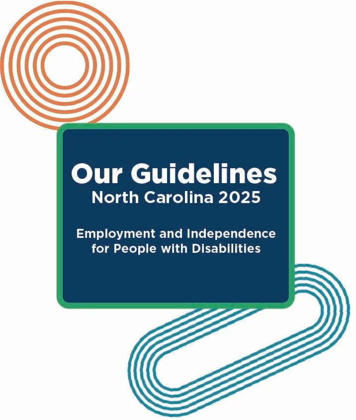
Division Brand Guide | Brand Standards & Consistency
Problem
The newly established division needed consistent visual standards so that future communications would use the same logo, colors, typography, and overall visual treatment.
Process
Created a brand guide that documented the division's approved logo, colors, and fonts and organized the information into a clear, easy-to-reference format. Included the completed guide as a page-by-page flipbook so users could review the visual standards and see how the elements should be applied.
Results
Created a practical reference guide that provided a consistent visual foundation for future division communications. The guide gave users a centralized resource for applying the division's logo, colors, and typography consistently across materials.
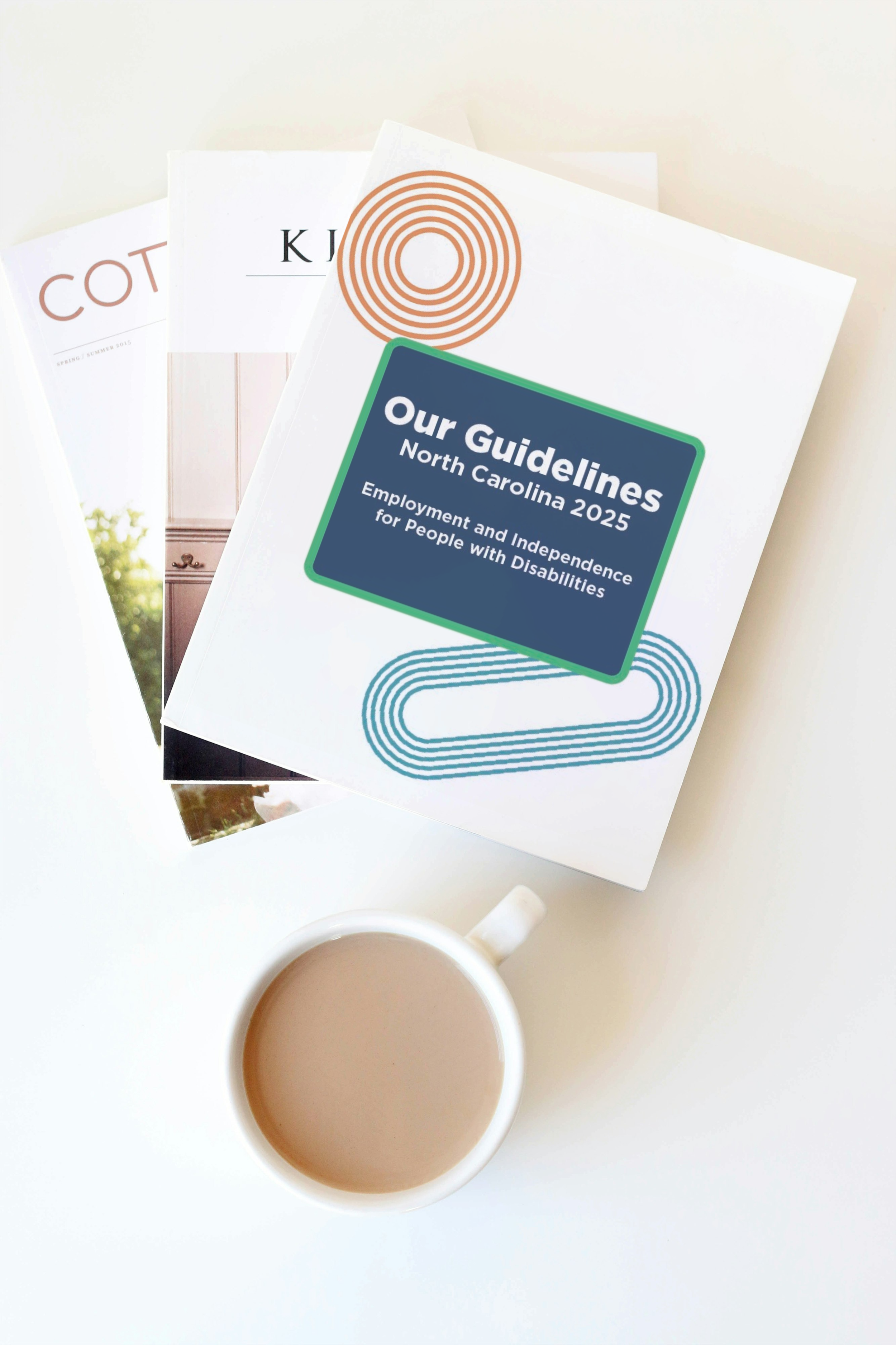
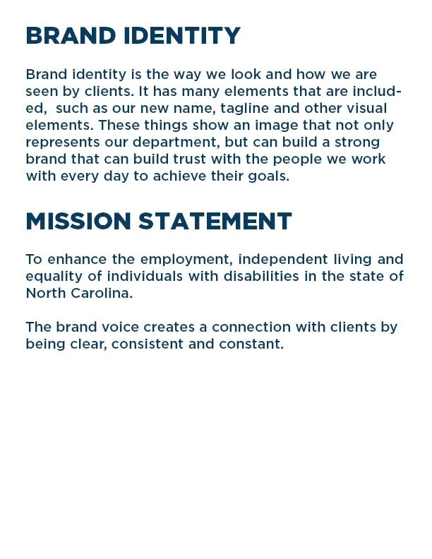
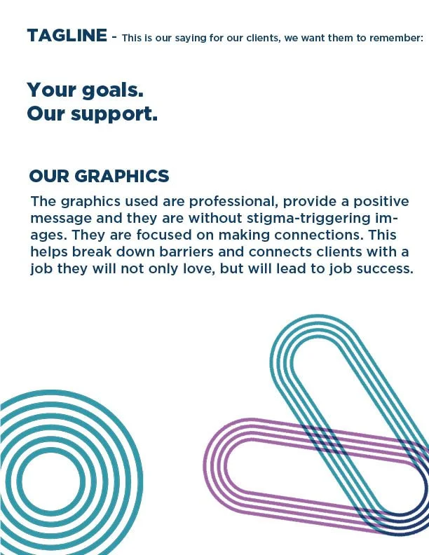
Flipbook, click the arrow: Entire guidelines pages
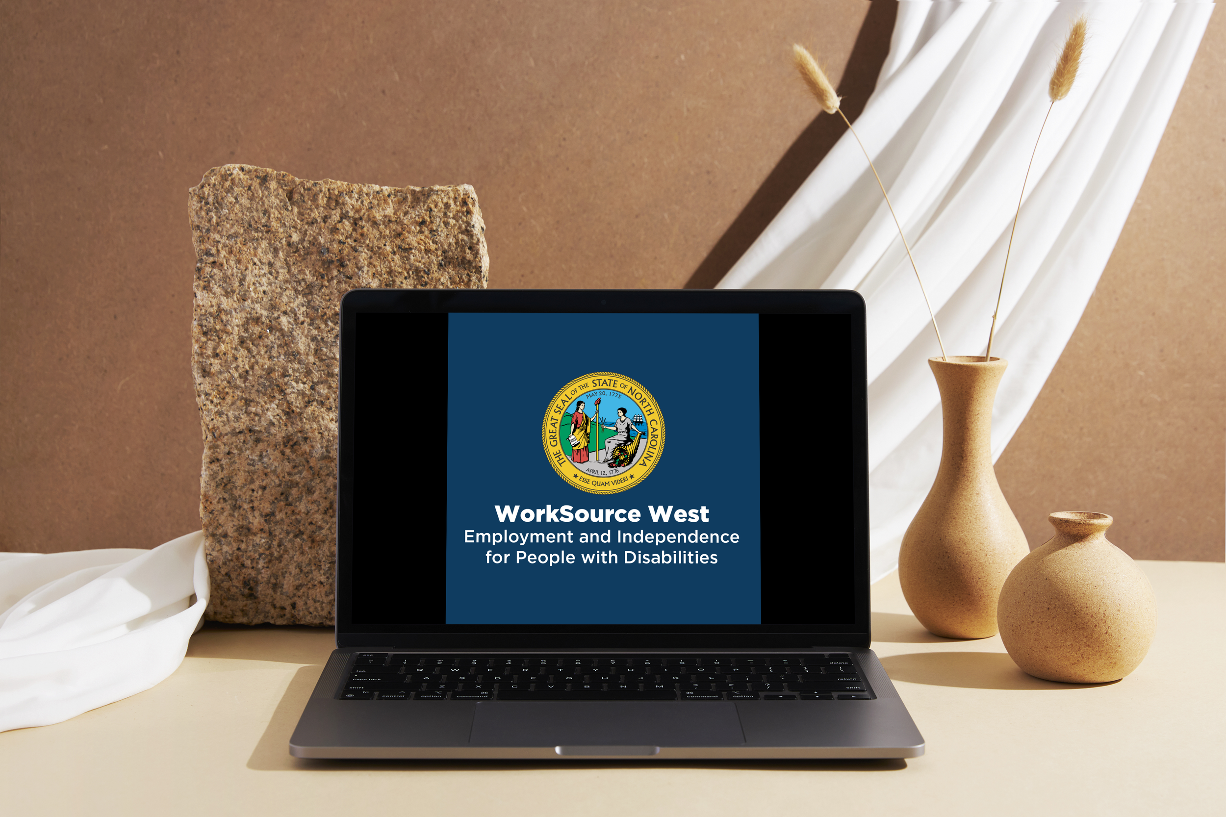
Social Media Outreach | Digital Design
Problem
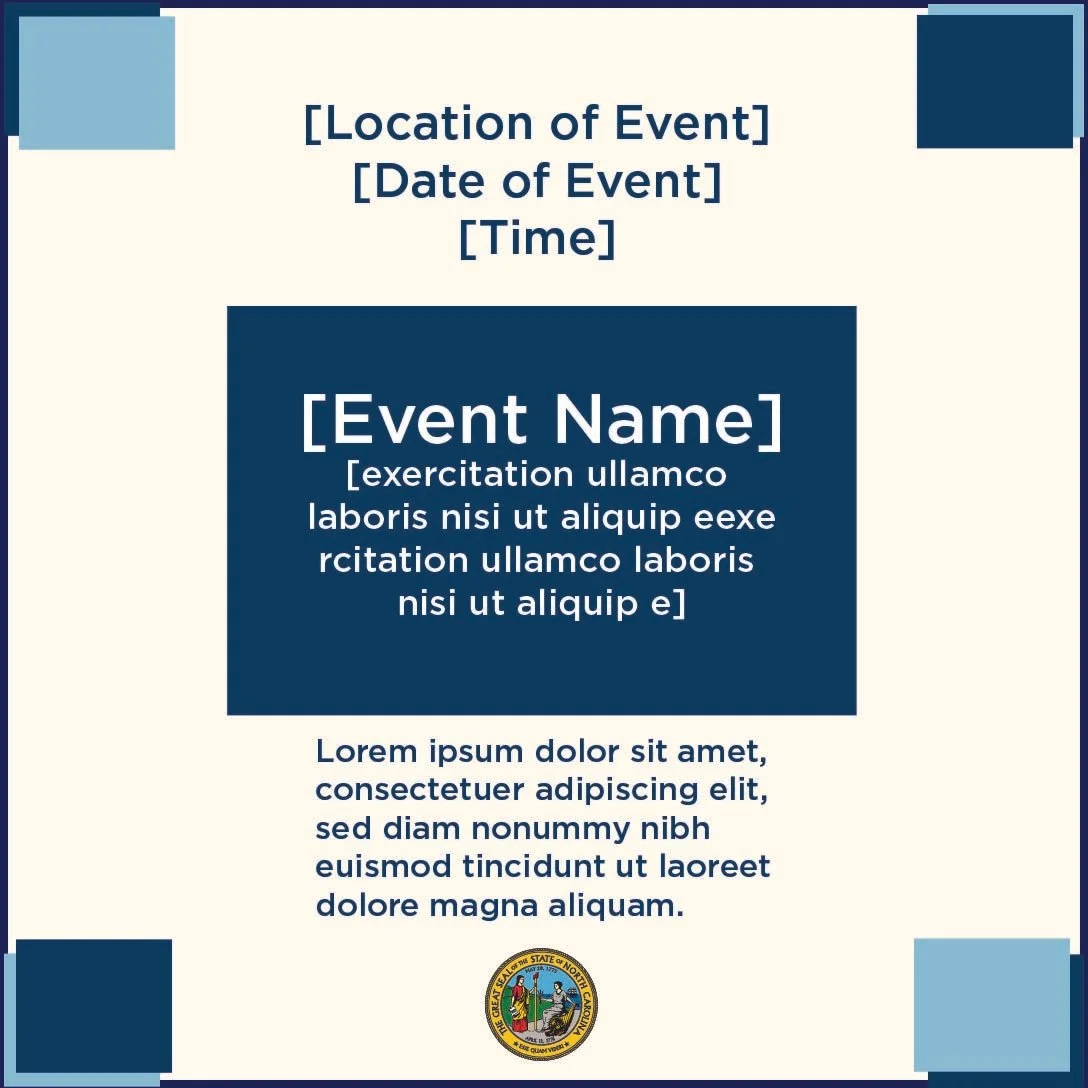
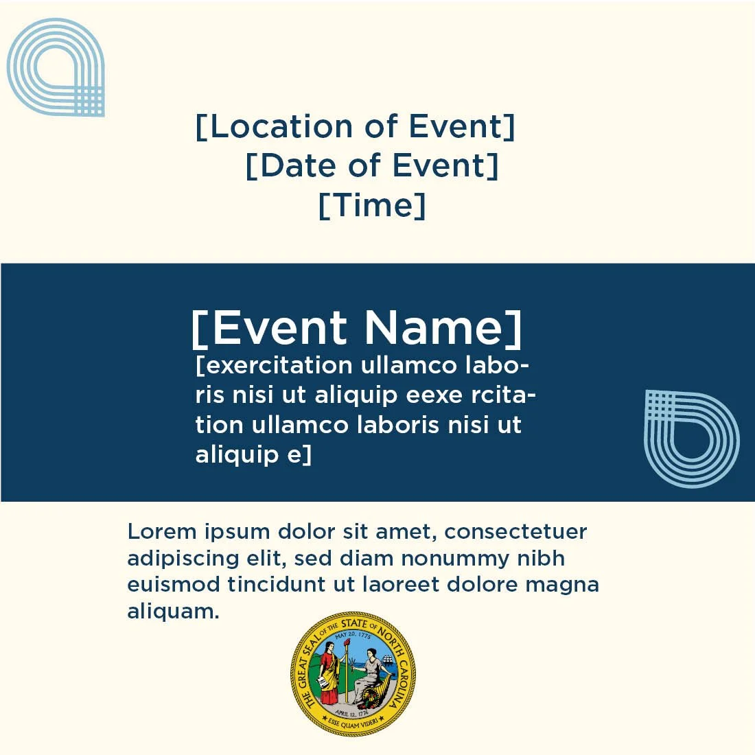
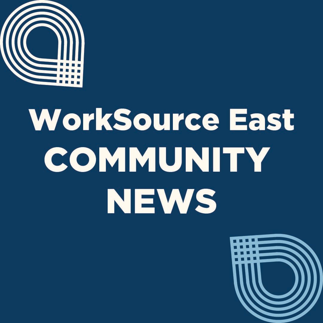
The department needed digital graphics to communicate outreach information clearly and consistently across social media. The graphics needed to follow the division's established visual identity.
Process
Discussed the communication needs with a co-worker to understand the information and purpose of each graphic. Applied the division's established style guide by using the approved colors, fonts, and visual standards while organizing the content into clear, readable digital layouts.
Results
Created consistent social media graphics that communicated outreach information clearly while maintaining the division's visual identity. The completed designs provided ready-to-use digital communications that followed the established brand standards.

Signage | Environmental Design
Problem
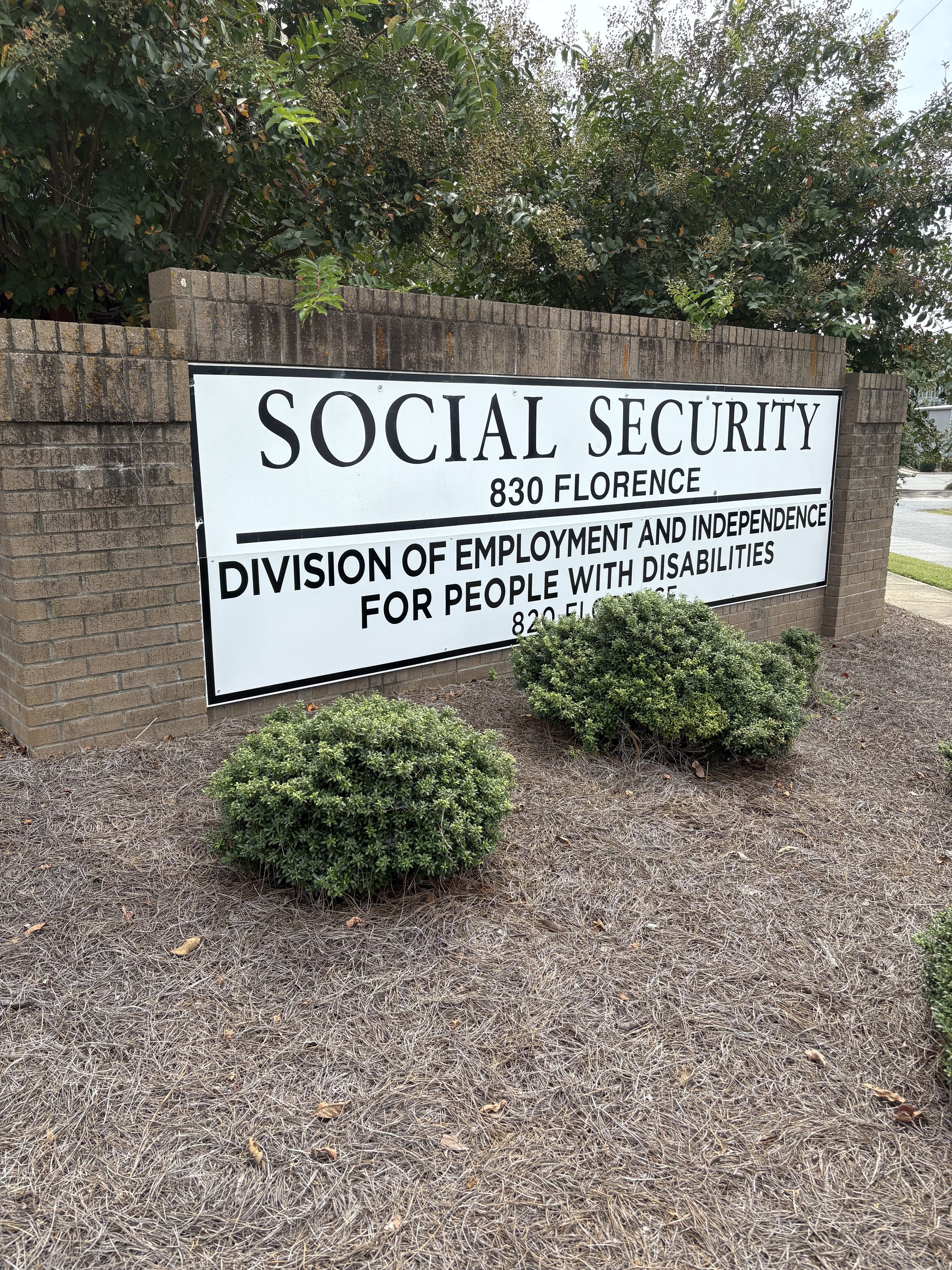
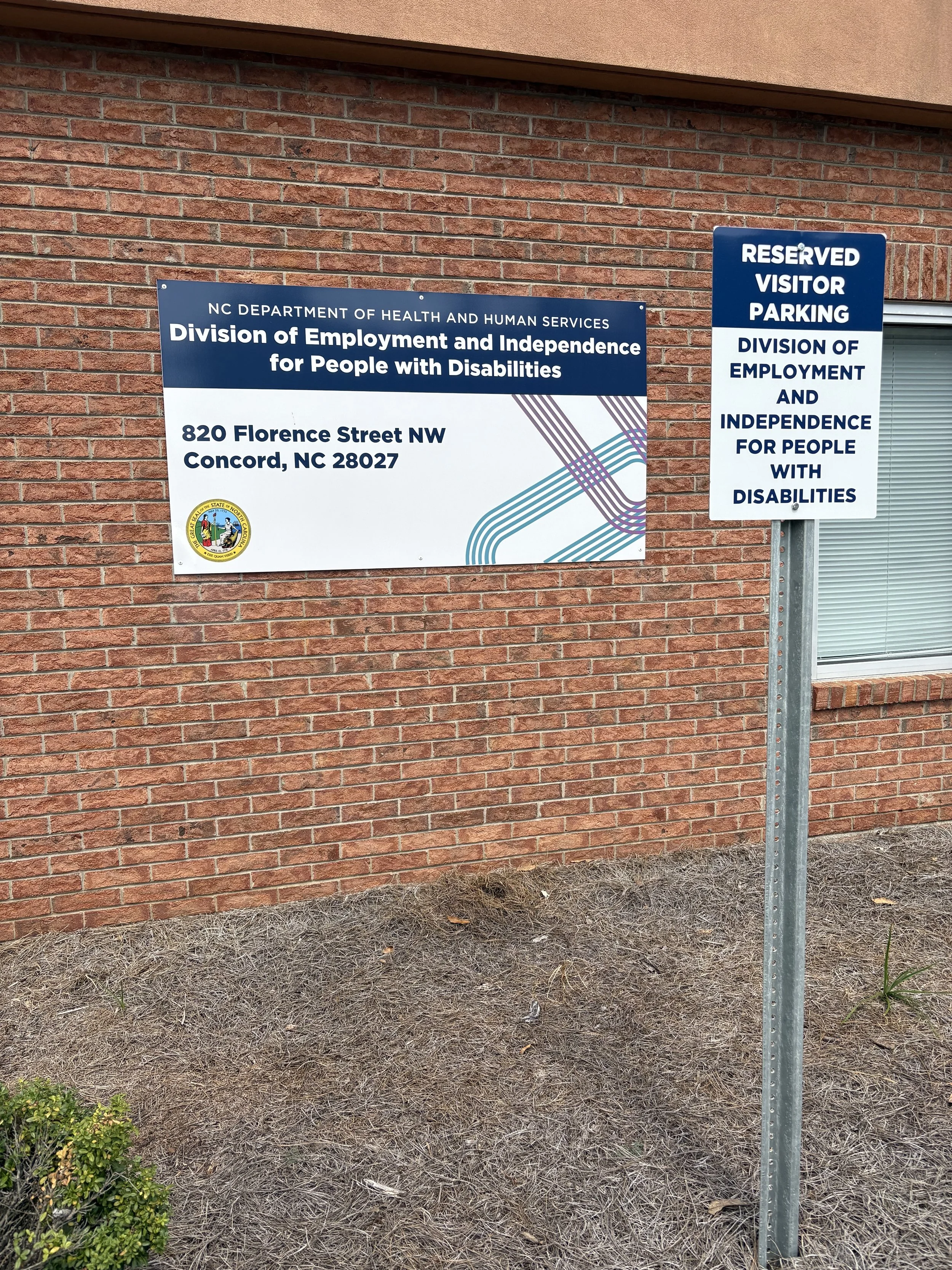
The department needed consistent signage for approximately 60 locations as part of a department name change. The signs needed to use the required graphics, fonts, colors, and overall layout, but each location had different sign dimensions, making a single standardized template impractical. Some locations required as many as four different sign sizes.
Process
Developed individual sign layouts for each location while maintaining consistent visual standards across the project. Adapted the placement and scale of text and graphics to fit each sign's dimensions while preserving the overall design approach. Reviewed the completed designs with my supervisor, incorporated approval and adjustments, and prepared the signs for production so each location received the appropriate sizes.
Results
Produced signage for approximately 60 locations, with each sign fabricated and installed at its designated location. The completed signs accommodated different physical dimensions while maintaining consistent graphics, typography, colors, and overall visual structure throughout the department name-change initiative.
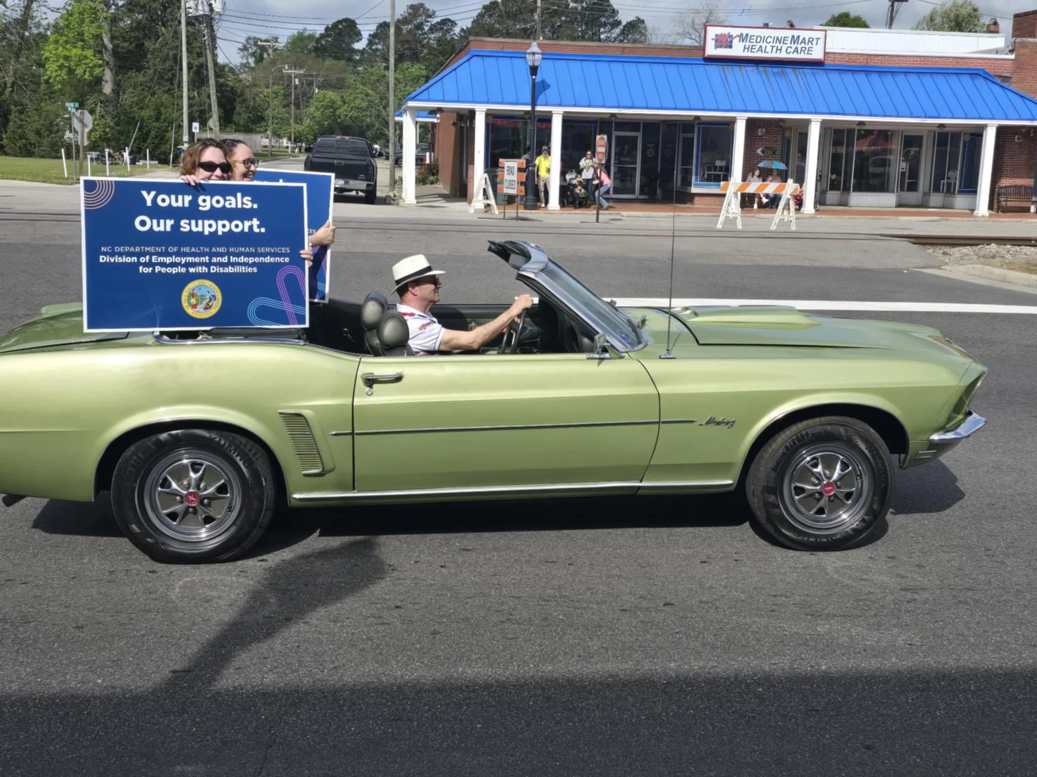
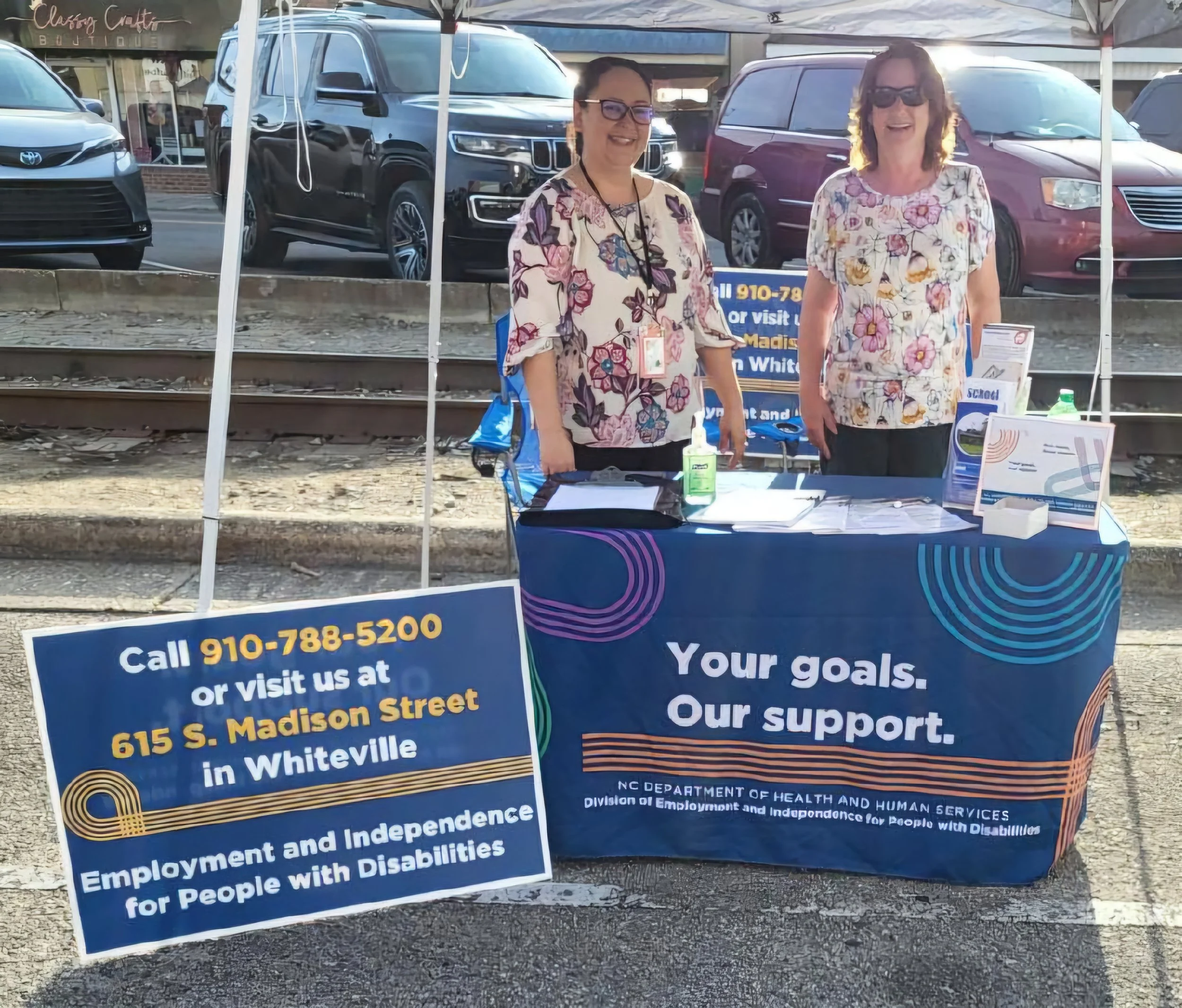
Parade Outreach | Poster & Promotional Design
Problem
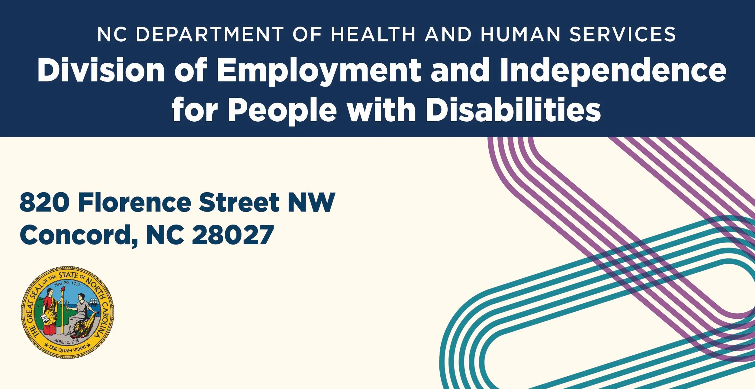
The department needed promotional materials for a parade to introduce its new name and division. The initial concept was to create materials that could be attached to the sides of the parade cars, but after reviewing the production estimate, the team decided that handheld posters would be a more practical option for participants riding in the cars.
Process
Designed posters specifically for parade participants to hold while riding in the cars, ensuring the new name and division could be clearly seen by spectators. Also designed a coordinating tablecloth using the new name and division's established colors, typography, and visual identity to maintain consistency across the promotional materials.
Results
Created coordinated parade materials that provided a practical alternative to the original car-mounted concept. The finished posters were used by participants riding in the parade cars, while the tablecloth extended the new division's visual identity to the event's display area.
EIPD | Branded Materials
Problem
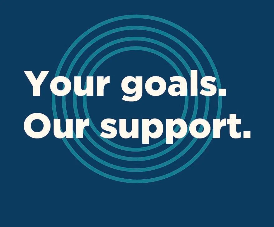
The division needed branded materials to introduce its new name to the public and create a consistent visual presence across different promotional formats. The materials needed to use the new graphics, colors, and typography consistently.
Process
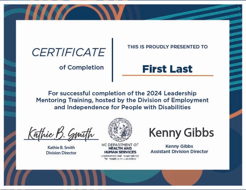
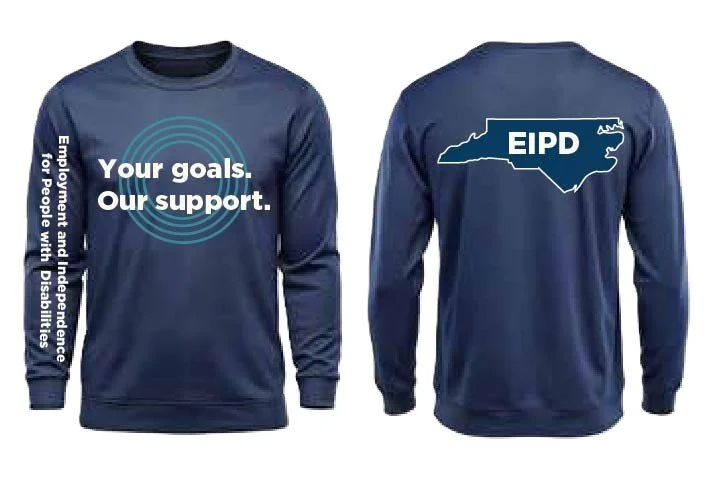
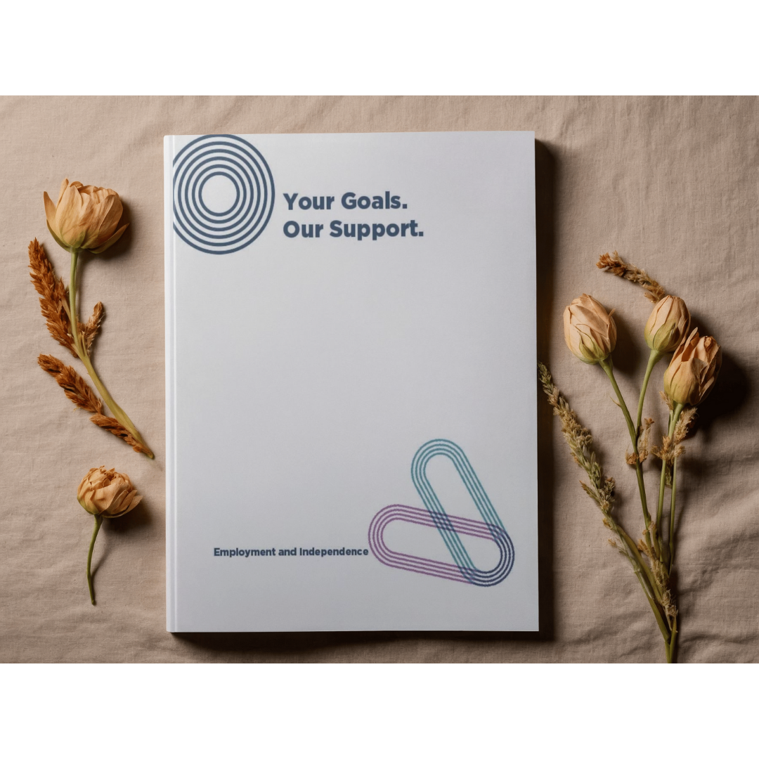
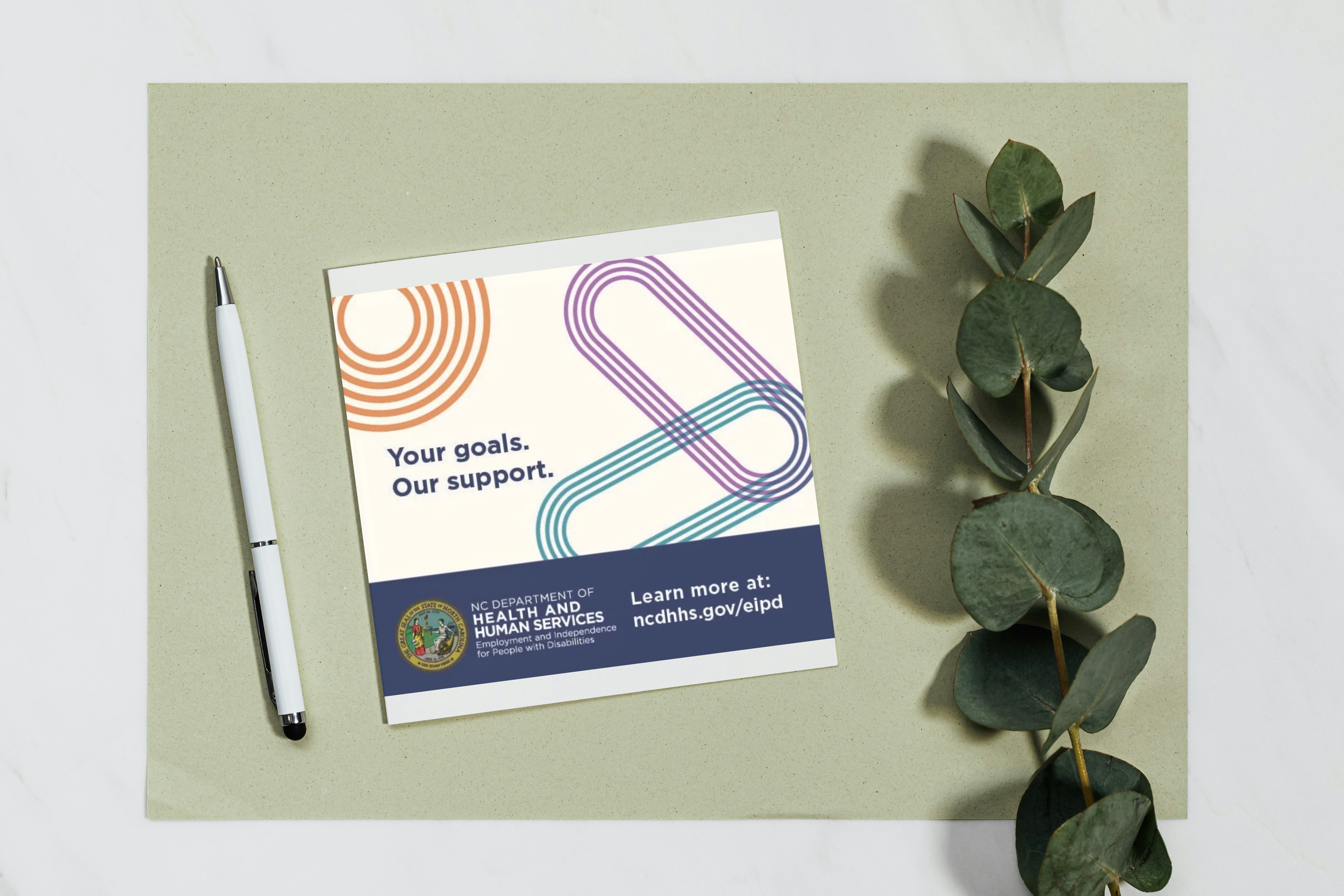
Designed a coordinated set of branded materials, including a T-shirt, certificate, postcard, and notebook. Applied the division's established logo, colors, typography, and visual elements across each format while adapting the design to the individual purpose and dimensions of each item. Developed long-sleeve T-shirt concepts that incorporated the division name on the sleeve as well as the main garment.
Results
Created a cohesive set of branded materials that demonstrated how the new division identity could be applied across promotional and organizational items. The director particularly liked the long-sleeve T-shirt concept and its use of the division name on the sleeve, although the division ultimately decided to pursue a more professional shirt style.


North Carolina Music Hall of Fame | Illustration & Merchandise
Problem
The North Carolina Music Hall of Fame needed engaging educational and promotional materials that would appeal to museum visitors, particularly children, while supporting its mission of celebrating North Carolina's musical heritage.
Process
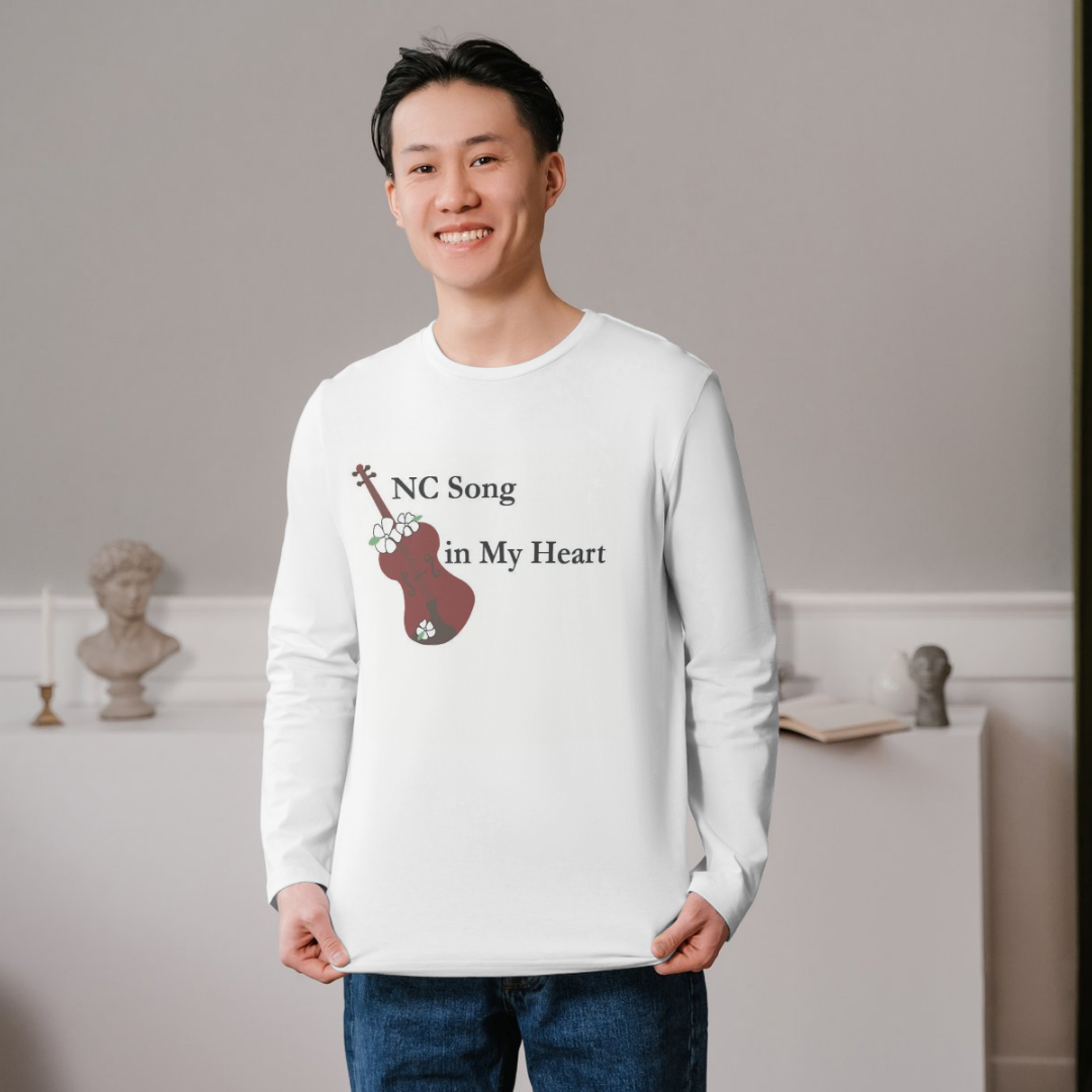
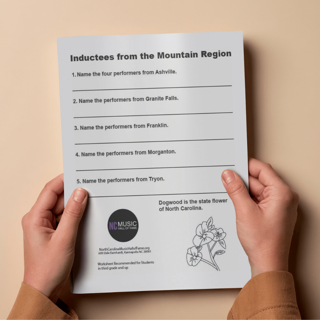
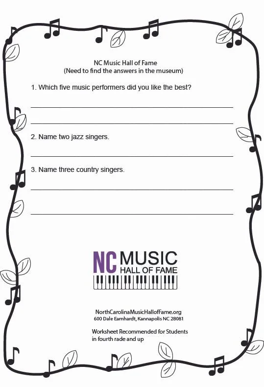
Created custom illustrations for a museum T-shirt and two children's activity worksheets. Developed playful, age-appropriate visuals and organized the worksheet layouts to make the activities easy to understand and engaging for young visitors, while maintaining consistency with the museum's visual identity.
Results
Delivered a cohesive set of family-friendly materials that combined education and promotion. The T-shirt extended the museum's visual identity into merchandise, while the two activity worksheets provided interactive materials designed to support children's learning and engagement with the museum's content.
Michelle Irwin
irwinmichelle2026@gmail.com
Contact me by using the above email address or click on Contact Me.